7) Highlights
Highlights
are in my opinion, the most important touch. Shadows solidify
an image; highlights make it real. I add another grouped
layer to all of my grouped layers, and this will be for
highlights only. This layer is set to "screen"
like the line art layers are set to "multiply."
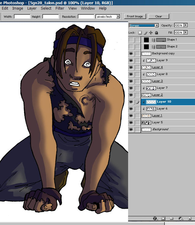
I like to use a color
(in this case orange because of firelight) that's bright,
but not too saturated. I use a very soft brush at low opacity,
around 30-40% and highlight the parts of the image closest
to the light source.
|
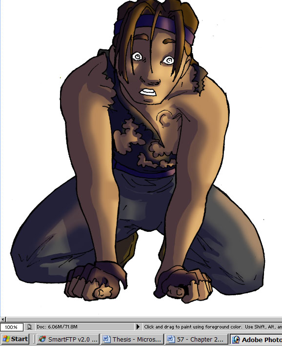
8) Backlighting
Backlighting is something
that I think far more artists should take advantage of.
The only time you DON'T have natural backlighting is when
there is one strong, intense light source in a dark, dark
environment...and even then...it's iffy. What is backlighting?
Well, on the darkest part of the shadows, you can see a
sliver of light. Sometimes this sliver is reflected light.
Sometimes it's from a competing light source. In this image
for example, the main source of light is the fire, but Talon
is backlit by the moons. Using the same brush that I used
for highlighting, I add bright, blue (at about 30% saturation)
color at 40% opacity. If the backlight source is closer
and/or very bright, then the opacity and the hardness of
the brush is higher. Vice versa if the backlight source
is futher away.
|
9) Final Touches:
As one would think,
the final touches are added last. Silver in the hair, eye
color and mouth color, background, that kind of stuff. About
backgrounds, mine are always on a separate file, reused
and inserted behind all the colored layers.

And that's the end
of the tutorial! I hope it was helpful^^
|
|
|
The
War of Winds and all related ideas and concepts © copyright
Karen Howard, unless otherwise stated.
ALL RIGHTS RESERVED.
|
|